Security teams are not short on data. They are short on time and clarity. Understanding how an asset behaves, what it is exposed to, and what risks it introduces often requires piecing together information from multiple views. Even when the data exists, the effort required to interpret it slows investigations and delays action.
Sweet’s Enhanced Asset Graph was built to close that gap. It delivers a clear, unified, and consistent way to understand any asset at runtime, so teams can move from visibility to action without friction.
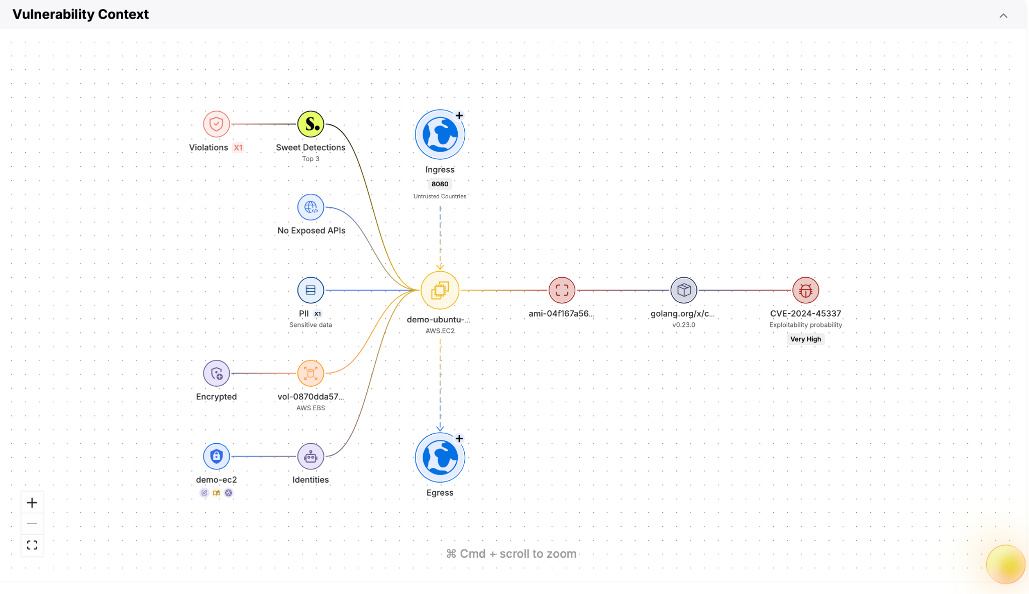
Now, that clarity is available wherever investigations begin. The Sweet Asset Graph is accessible across risks, findings, vulnerabilities, AI, and more, ensuring that no matter where teams start, they can immediately understand asset behavior in full context.
What is the Sweet Asset Graph?
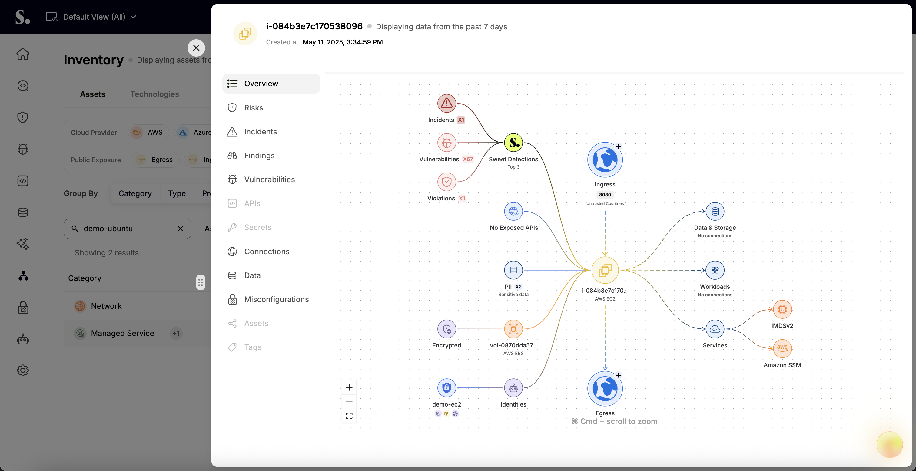
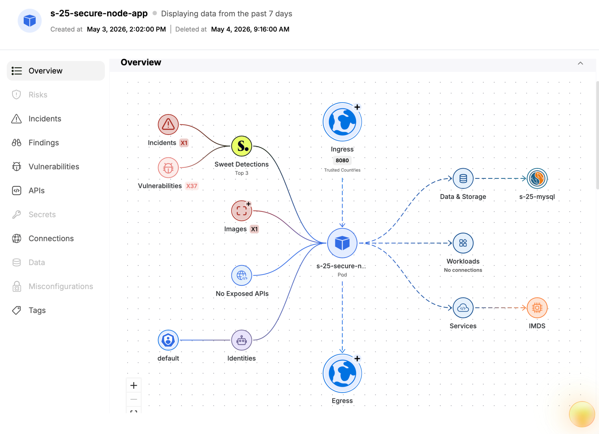
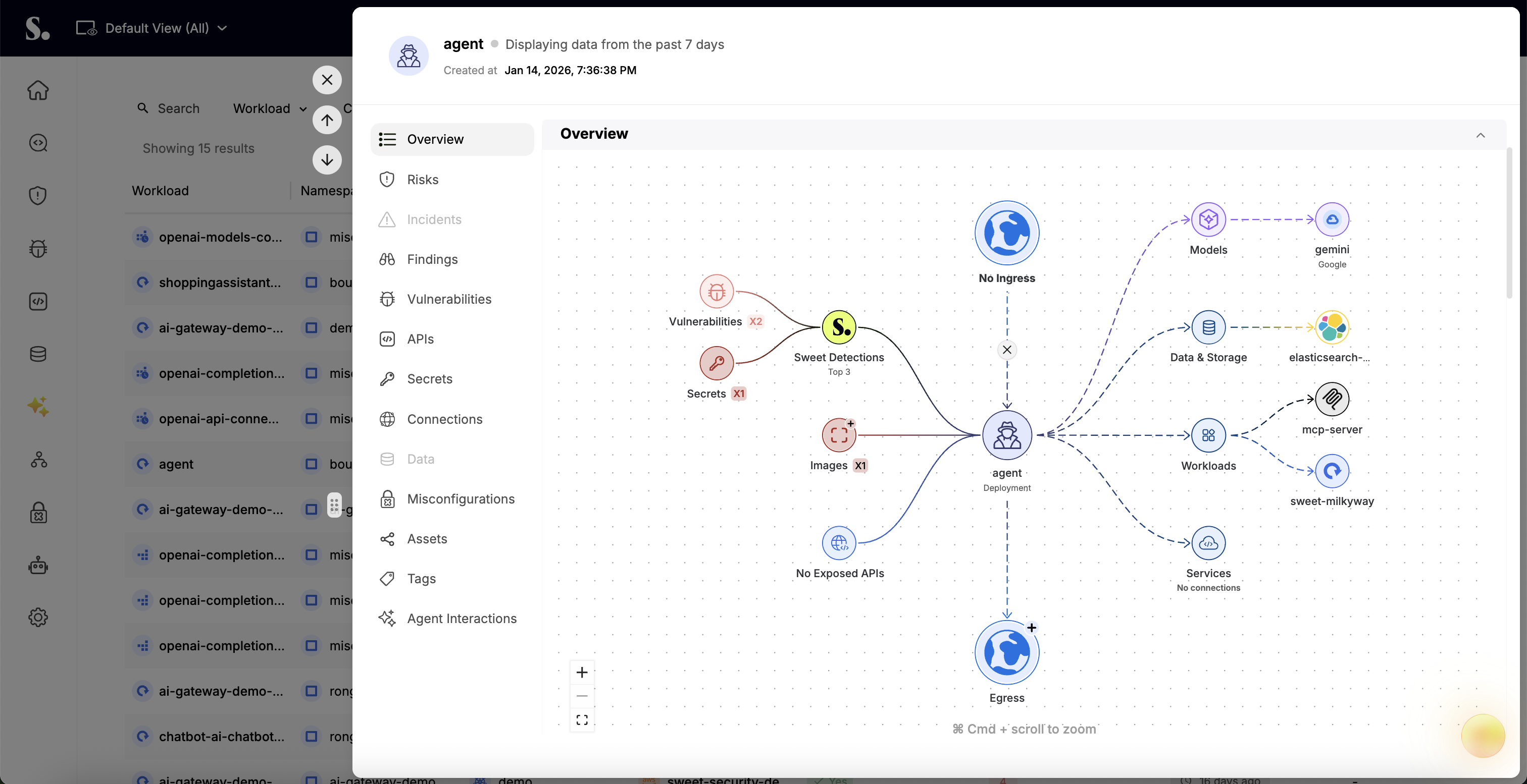
The Sweet Asset Graph is a unified view that maps how an asset operates within your environment at runtime. It is accessible throughout the platform wherever asset context is relevant. From any insight connected to an asset, teams can open the asset drawer and view the Asset Graph directly, without needing to navigate away.
This expanded availability is a key part of the enhancement. Whether investigating a risk, reviewing a vulnerability, analyzing data exposure, or exploring AI-related activity, the same Asset Graph experience is always available in context.
It brings together network activity, identities, and risk signals into a single, easy-to-understand view .Instead of analyzing these elements in isolation, the Asset Graph presents them together, making it easier to understand how everything connects.
Each asset is visualized across four key dimensions:
- Ingress: incoming network traffic to the asset, including connections from external sources
- Connections: what the asset is communicating with
- Egress: outgoing network traffic from the asset to external destinations outside the network
- Security insights: prioritized context to help you quickly understand and act on risk
This structure allows teams to quickly move from a high-level view to actionable insights without needing to pivot across tools or tabs.
Understand Risk in Context with a More Structured View
The most important improvement in the Asset Graph is not just more context. It is how that context is presented. The layout of our Graph is intentionally stable and consistent. Key sections do not move, and node placement does not shift between assets. Teams always know where to look, which reduces the time it takes to understand a situation and removes friction during investigations.
When data is not present, the structure remains intact and those areas appear empty rather than reorganizing the view. This eliminates the need to reorient and makes it easier to compare assets across environments.
The graph also adapts to reflect how different asset types behave. For example, storage assets such as S3 do not initiate outbound connections, so their view focuses on inbound activity and runtime context. This preserves a consistent experience while accurately representing how each asset operates.
Built for Modern Workloads, Including AI
As environments evolve, so do the types of assets teams need to understand.
The Enhanced Asset Graph extends beyond traditional infrastructure to include AI-related assets and activity, bringing the same level of clarity and consistency to this emerging area.
Teams can now use the Asset Graph to:
- Understand how AI components interact with the rest of the environment
- Identify exposure paths involving AI services
- Investigate risks tied to AI usage using the same runtime context and structure
By incorporating AI into the same unified graph, Sweet ensures that teams do not need separate tools or workflows to analyze these newer risk domains. The experience remains consistent, regardless of asset type.
Turn Context into Decisions with Built-In Prioritization
The Sweet Enhanced Asset Graph is designed to help teams move from understanding to action without additional steps. Within a single view, teams can quickly determine how an asset is exposed, what it is communicating with, and whether sensitive data or risky behavior is involved. Detections are prioritized to highlight the most important issues, ensuring attention is focused where it matters most.
Additional context such as observed images, exposed APIs, encryption details, and identities provides the depth needed to assess impact and decide what to do next. Instead of gathering information across multiple views, teams can make informed decisions directly from the graph.
What’s Next
The Enhanced Asset Graph is designed to simplify how teams understand their environments and focus attention on what matters most. Looking ahead, the Asset Graph will continue to evolve with deeper context, expanded coverage across asset types, and additional ways to prioritize and act on risk.
Want to see how Sweet’s asset graph can help your team investigate faster and reduce risk more effectively? Schedule a customized demo with us to find out how.


.png)